New Museum Extension (Toby Devan Lewis Building)
How can a building be so new, but at the same time feel so old?
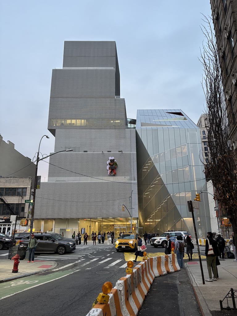
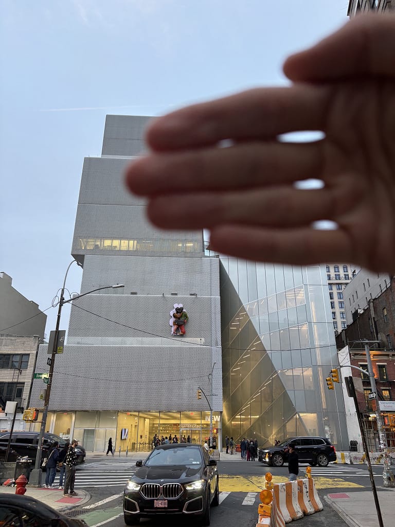
That’s what the extension to the New Museum, designed by OMA, feels like. Closed for the last few years, it opened to the public this past weekend for its inaugural run.
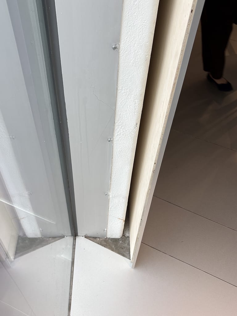
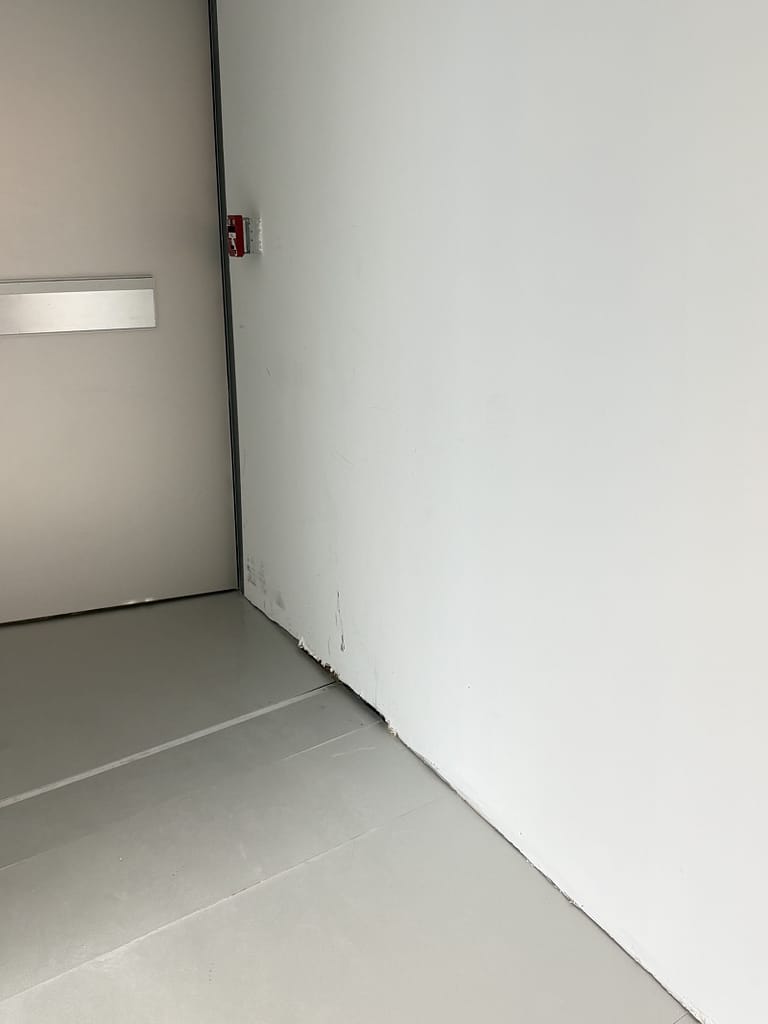
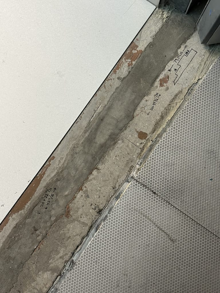
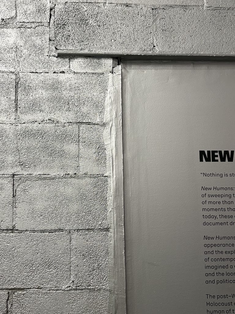
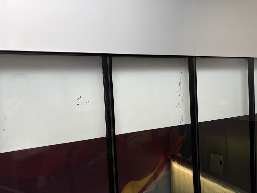
What they should have done was keep it closed and continue working through the punch list items.
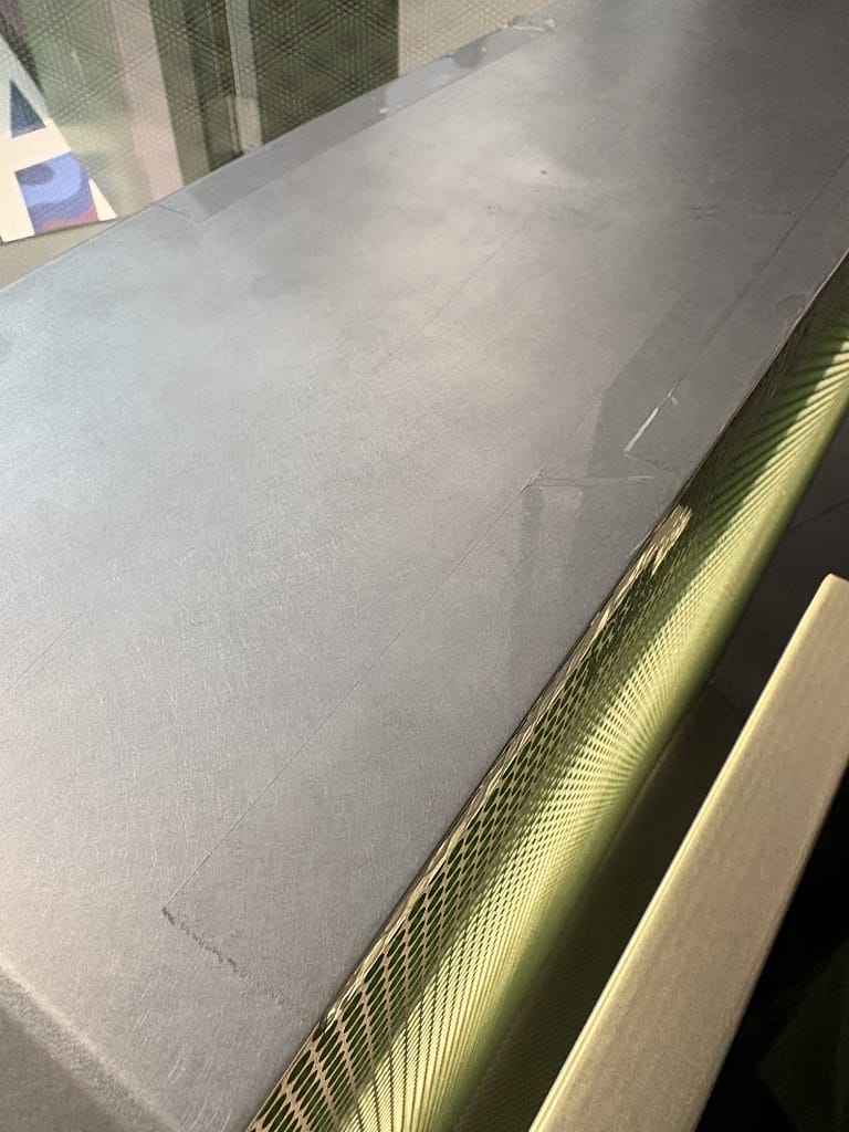
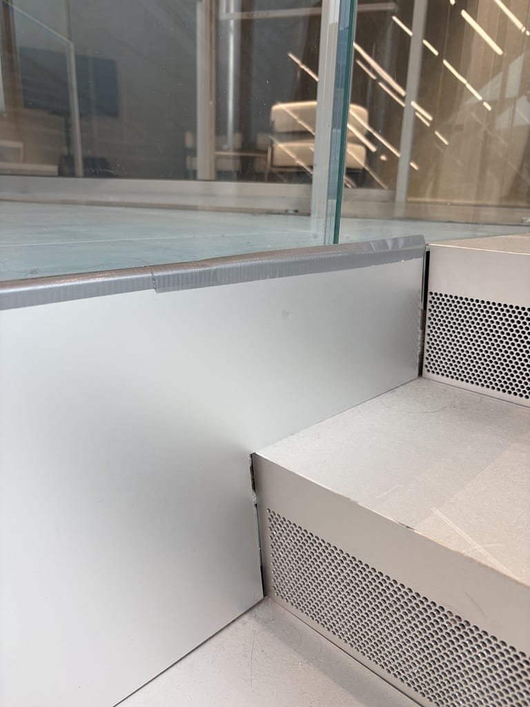
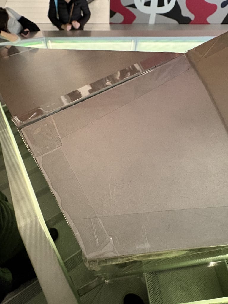
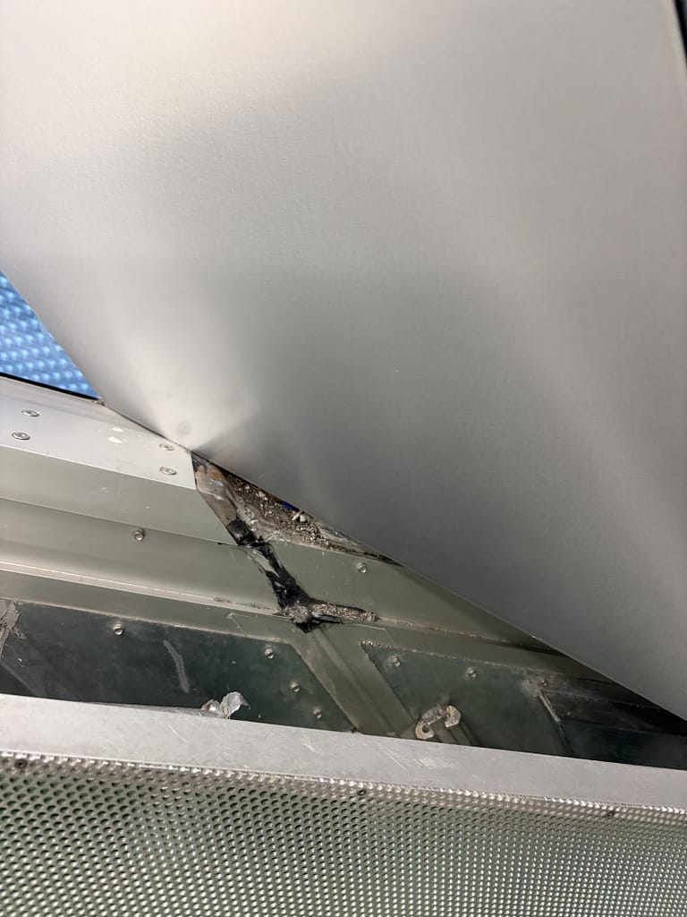
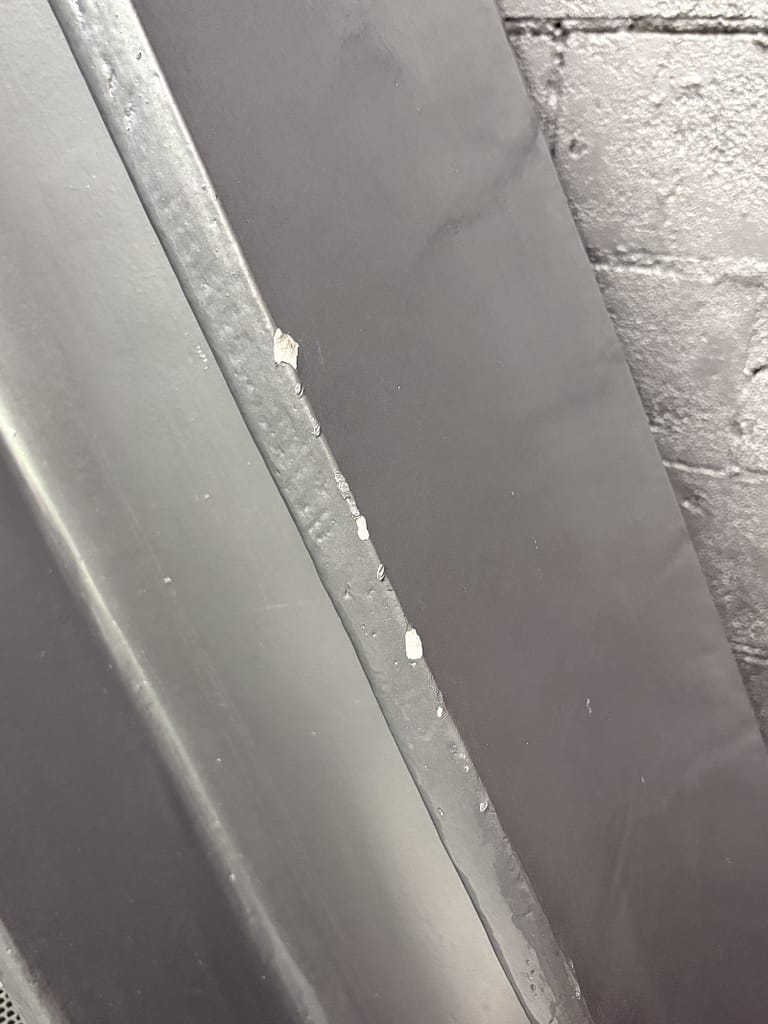
Some may be easy fixes, like missing panels, but others, like alignment issues or black paint on beams encased behind glass, may end up being permanent. They risk becoming a testament to poor execution of an already unimpressive design.
OMA, led by Rem Koolhaas, is a world-renowned architecture firm known for bold, ideas-driven work that first took shape in his 1978 manifesto Delirious New York. Their portfolio spans some of the most recognized buildings in the world, including the CCTV Headquarters, the Seattle Central Library, Casa da Música in Porto, and the Kunsthal in Rotterdam.
I can’t imagine the New Museum extension ending up on any list that includes those projects.
Opened in 2026, it already feels dated. It looks like a small skyscraper – a corporate office building you might find in Long Island City. And why the triangles? Why is one of them lined with what looks like purple cotton balls?
The design was selected nearly a decade ago, in 2016, out of a competition that promised something forward-looking, something optimistic about what the museum and the city could become.
Now that future has arrived, it’s hard not to stand in front of the building and wonder: this is it?
What’s most surprising is that, when looking at both buildings from the exterior, you could easily mistake the SANAA design, the older building, as the newer one, built to extend an existing OMA scheme.
The Whitney Museum, designed by Renzo Piano and completed in 2015, looks newer than this OMA extension. The interior of the Whitney, over a decade later, holds up far better than this recently finished building.
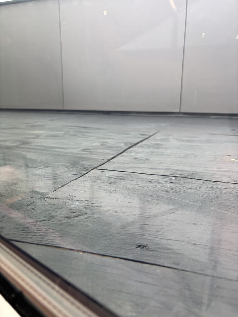
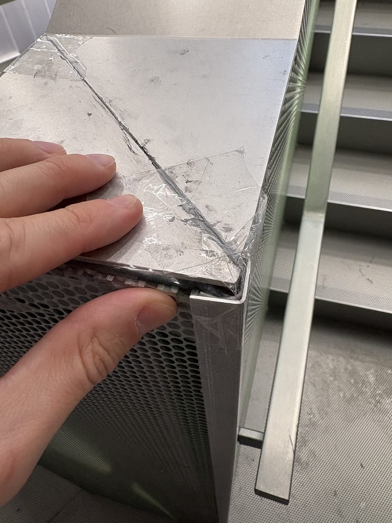
On the inside, the OMA building appears to be held together by clear packaging tape and duct tape, showing signs of a building that has been around for decades rather than one that just opened.
It’s surprising they allowed the public inside at all.
It also makes me feel significantly better about the work our contractors are doing on residential homes. Of course, it’s a different scale, but the follow-through is what separates a good building from a bad one.
It doesn’t matter what the architecture is trying to do if someone can cut their hand running it along a railing because a perforated metal panel doesn’t align with the top metal cap.